How Soon Is Now?

Visualising climate change chronology

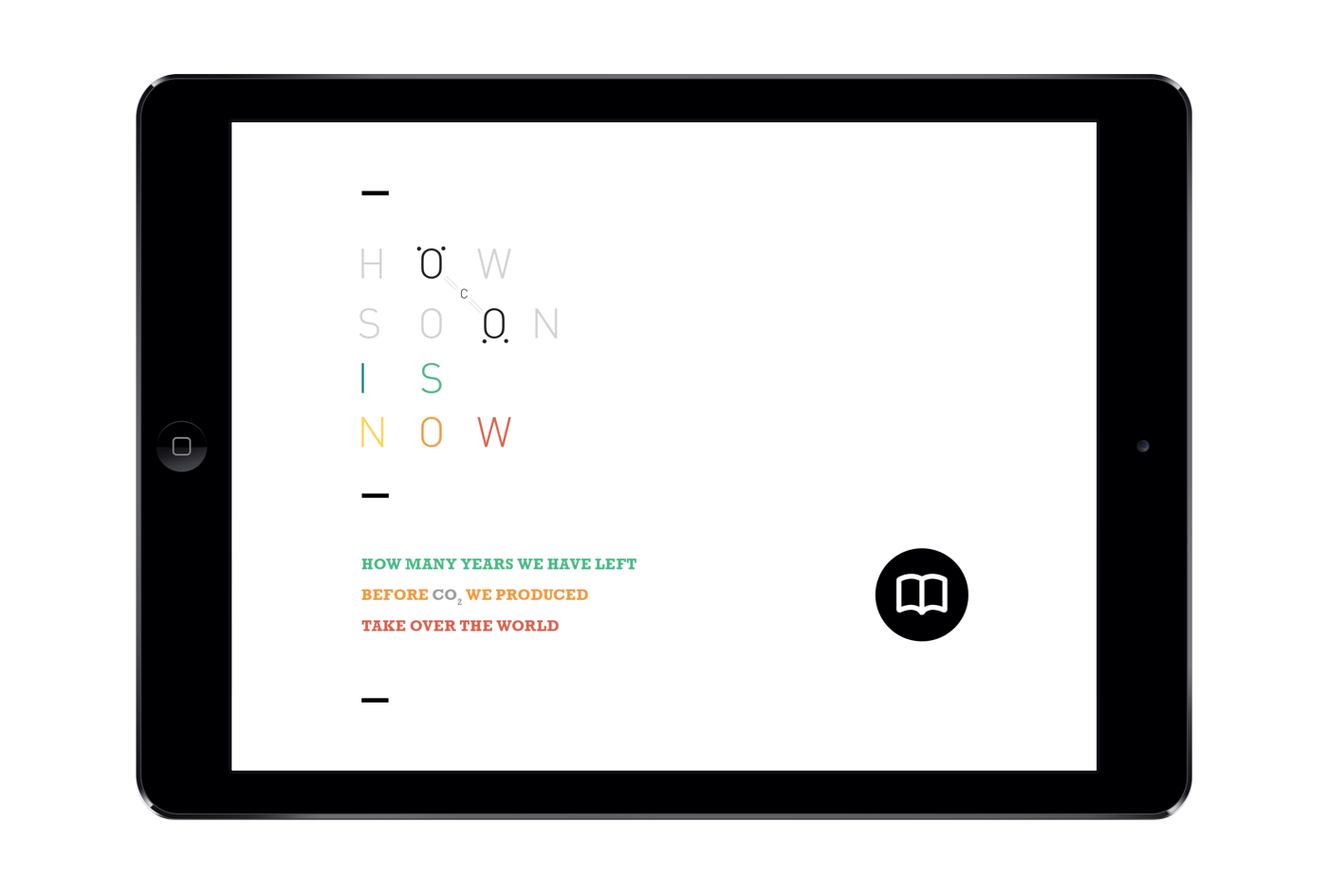
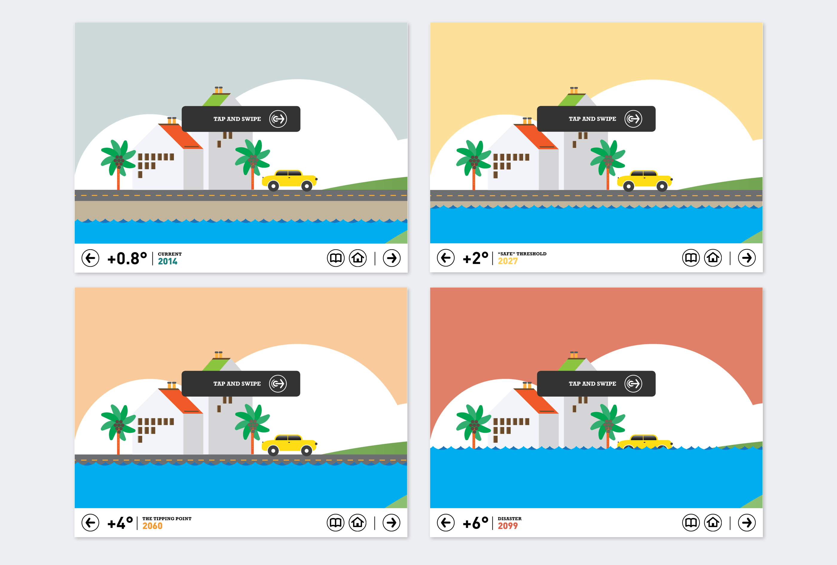
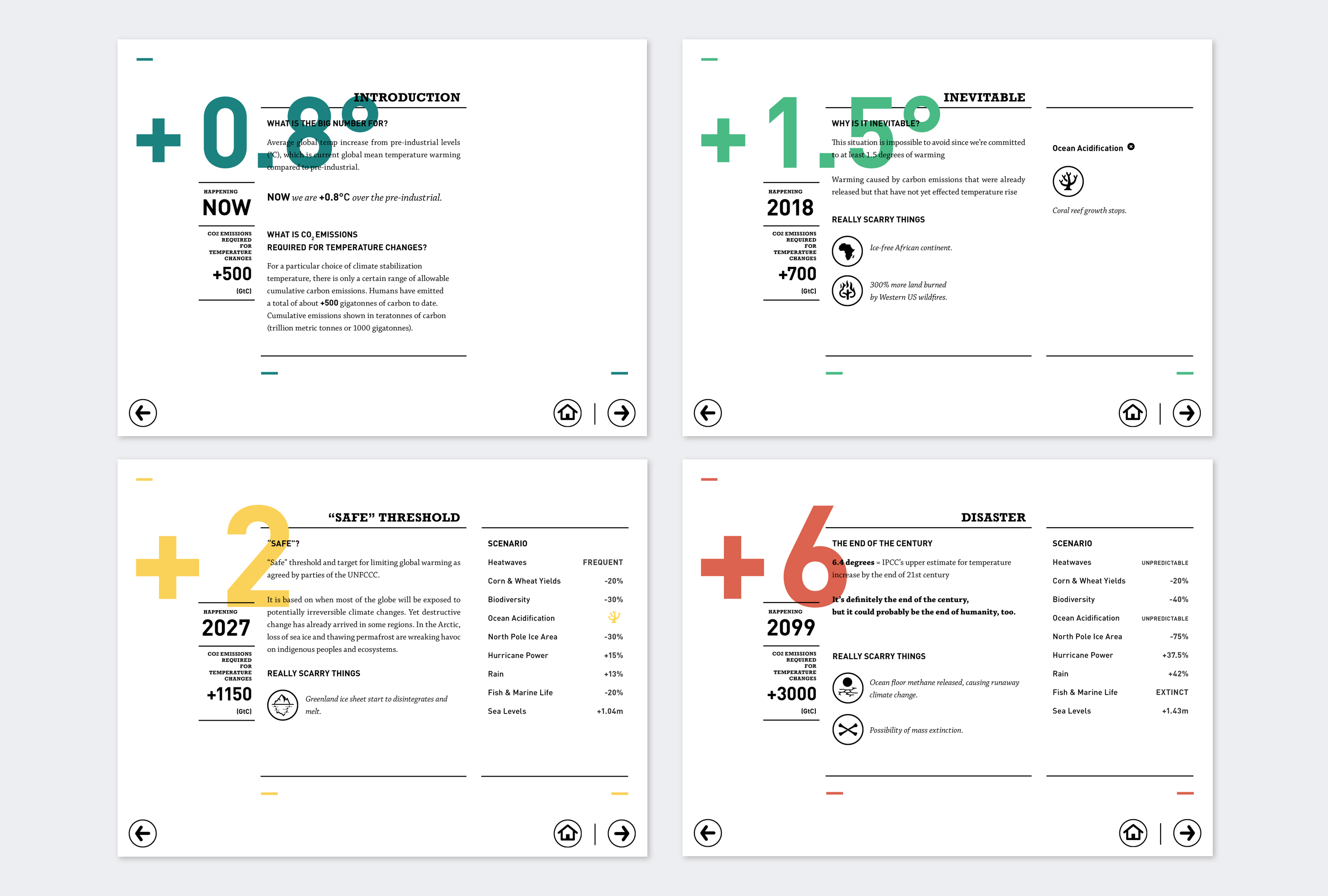
How Soon Is Now is an infographic project that emphasis on the importance of the effects that Carbondioxide (CO2) have on the global warming situation. The data and statistic that was used in this project was organised by David McCandless.

  • Personal Work
  • Information Design, Data Visualisation
  • 2014
brochure image
brochure image
brochure image
"When you say it's gonna happen "now" When exactly do you mean?"

- How Soon Is Now?, The Smiths

Conceptual

I focused on the amount of CO2 that human produced via the usage of fossil fuel, in relation with the rising temperature, negative effects on environments and disaster that will follow up.
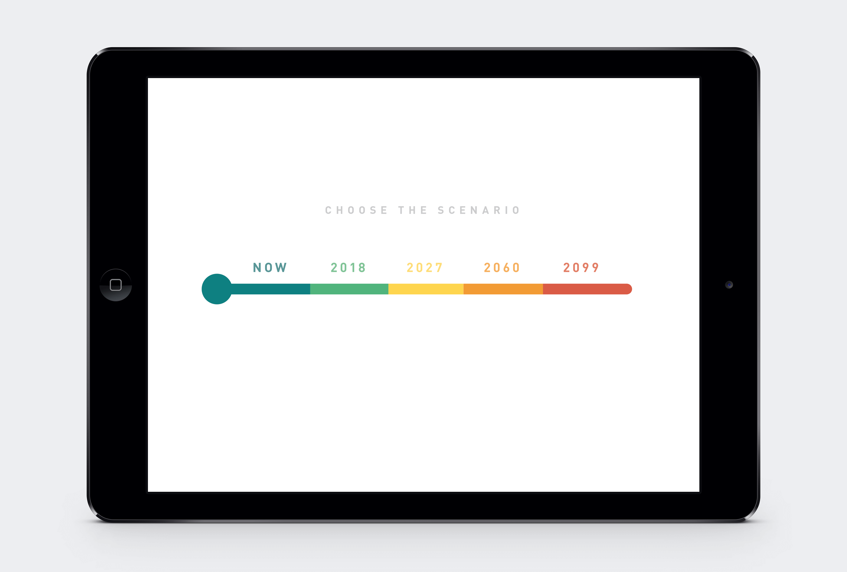
How soon is now?

The title of the project is a reference from the rock band The Smiths, from their 1985’s single “How Soon Is Now?”

The lewis dot diagrams between two O letters is a formula for Carbon dioxide, aka CO2.

How much CO2 that we had produced?
How soon is the climate change will be approaching us?
Unfortunately, it is now.
responsive priview
Visualising Information
As the infographic were mainly focused on the climate change and its effects, the colour pallet was chosen to represent the rising temperature. Several elements in was changed little by little as the world move towards higher temperature.
See the how it works in the video
Related Projects